The Home of Filmmaking
Where the film industry connects, hires, and works
FILMD is where cast, crew and creatives build profiles, find work, manage productions and build trust in one place.
As Featured In


21,000+
Cast, Crew & Creatives
UK-Wide
With Global Reach
430+
Productions Created
1
Platform for Everything
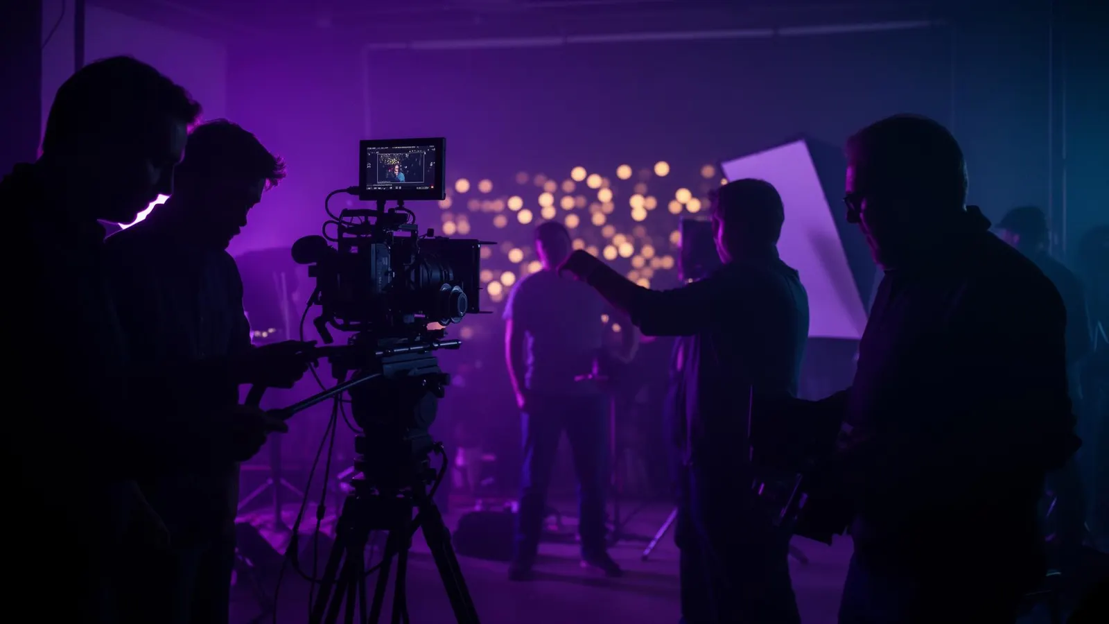
FILMD in 30 seconds
Watch how 21,000+ cast, crew, and creatives are using FILMD to build careers and run productions.
Built for everyone in film
Whether you're an actor auditioning for your first role, a runner on your first set, or running a production studio - FILMD is your home.
For Cast, Crew & Creatives
Build your career, showcase your work, and get discovered by productions looking for talent like you.
Explore FILMD for FilmmakersFor Productions
Find verified cast & crew, manage your production, and run team comms and scheduling all in one place.
Explore FILMD for ProductionsFor Partners & Studios
Studios, schools, and organisations - integrate with the platform the film industry is building on.
Explore FILMD for PartnershipsEverything you need, one platform
No more scattered tools. FILMD brings profiles, projects, payments, and reputation together.
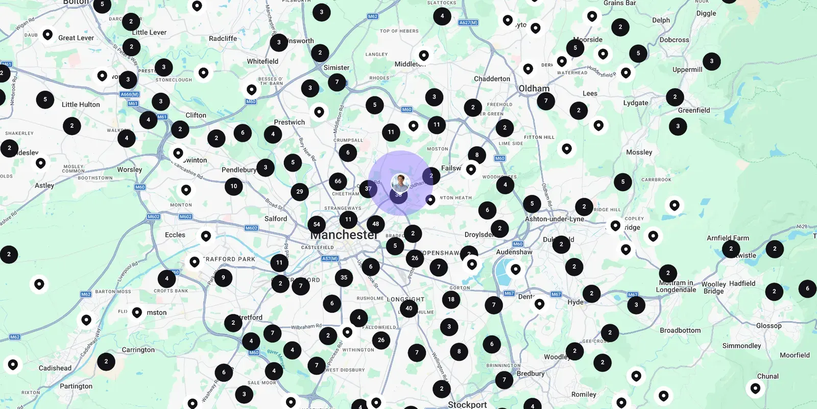
Members Map
Find cast, crew, creatives, and equipment by location. Build your ideal team from local talent across the UK and beyond.
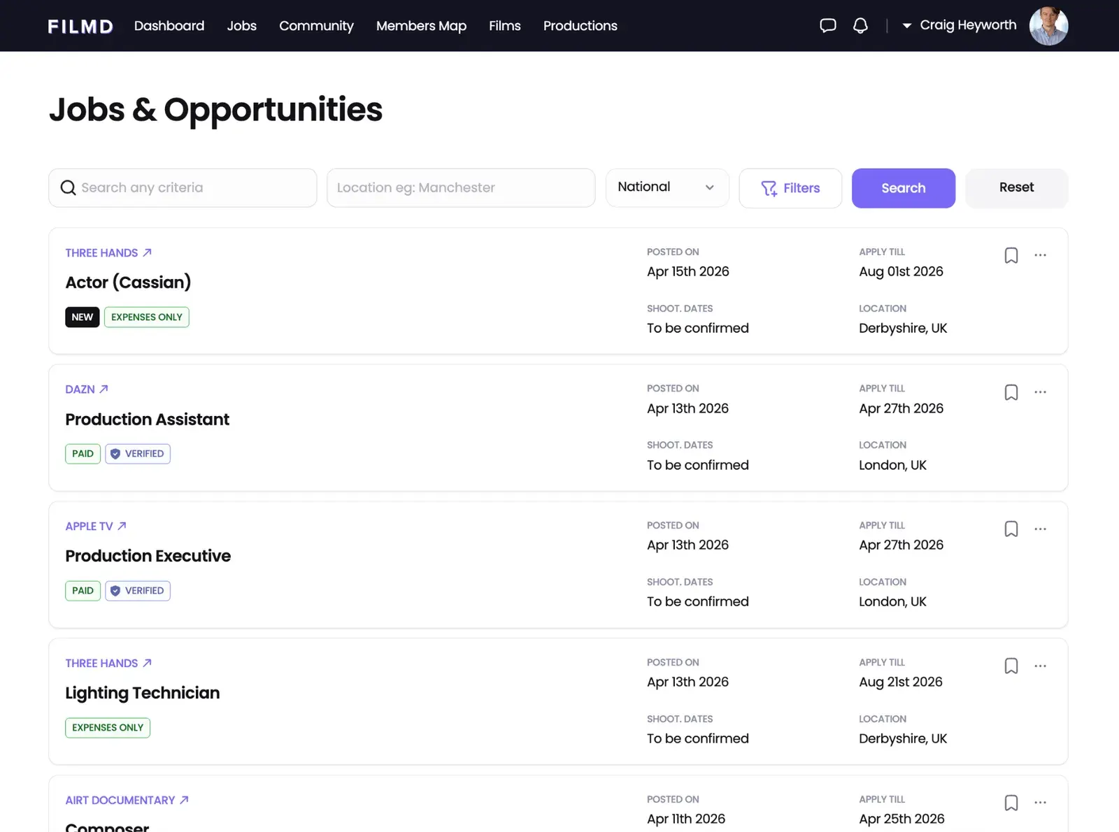
Job Management
Post jobs, manage submissions, and streamline casting and crew management for productions of any size.
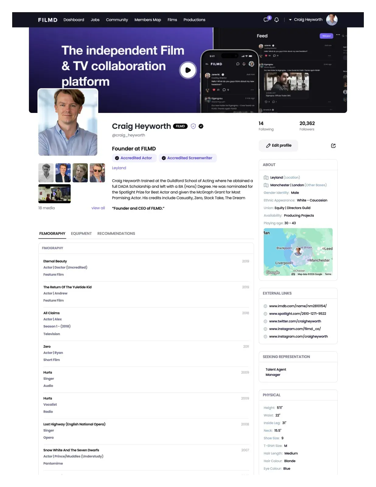
Accredited Profiles
Trust built in. Verified identities, FILMD Accreditation, and transparent reputation.
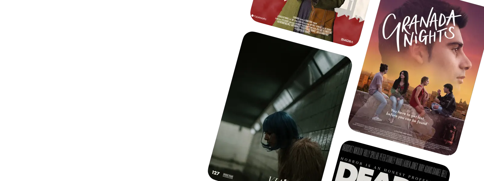
Screening Room
Watch and upload independent films in a members-only screening room. Your work, seen by the right people.
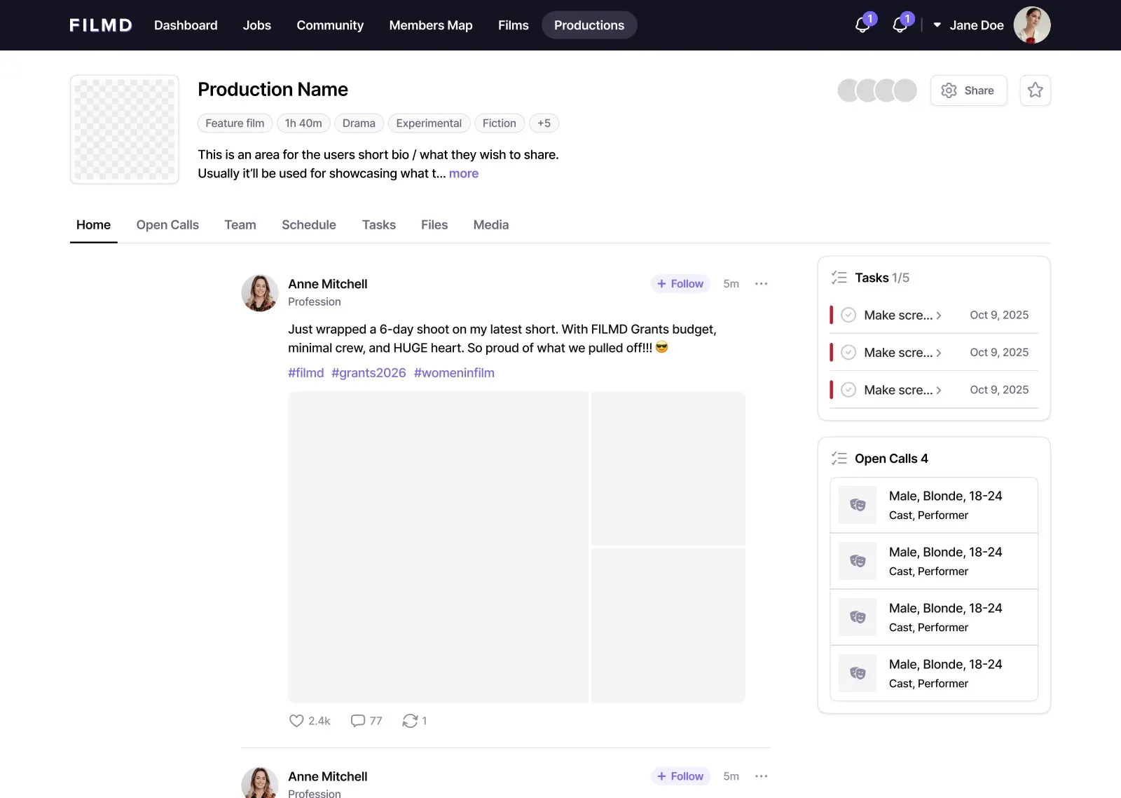
Production Suite
Manage entire productions from script to screen - call sheets, compliance, onboarding, and team comms.
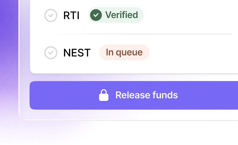
FILMD Pay (coming soon)
Compliant payments, contracts, PAYE, pensions, and RTI - all handled seamlessly so you can focus on the work.
Plus more features
Our members, everywhere
21,000+ actors, filmmakers, and crew across the UK and beyond - all in one place.
UK-wide with global reach
FILMD was born in the UK and is the fastest-growing platform for the UK film industry. But our community doesn't stop at borders - we have active members across Europe, Canada, the USA, and beyond.
- 21,000+ members and growing fast
- Actors, directors, crew, and every role in between
- Used on productions across the UK and internationally
21K+
Members
50+
Departments
12
UK Regions
24/7
Access
Take FILMD everywhere
The FILMD app is available on iOS and Android. Stay connected, apply for jobs, and manage your profile on the go.
Trusted by real filmmakers
"This is the best online filmmaker's experience I've ever had."

William Simmons
Director
"The platform works! I've already made my first connection and collaboration."

Grace Alwyn Ashworth
Writer | Director
"Exactly what young and aspiring filmmakers need!"

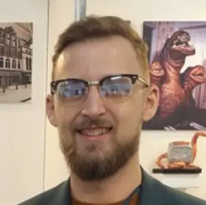
Jim Trotman
Director of Photography
"I'm so happy a platform like this has finally come about. Having access to this will massively help me in building up a portfolio of work."
Jack Stocker
Props Supervisor
"Congratulations on creating such a great platform - kudos for coming up with this amazing idea and implementing it!"

Anisa Butt
Actor | Screenwriter
"This is a great resource and I'm super pumped about it. It's tough starting over developing a community, but this feels like it's a little inch closer to meeting folks."

Matthias Sundberg
Writer | Director | Editor | Producer
"We believe filmmaking deserves a home. Not a patchwork of spreadsheets, DMs and closed doors - but one living, breathing place where the industry actually lives."
FILMD
Ready to find your home in film?
Join 21,000+ cast, crew, and creatives already building their careers on FILMD. Free to start.